Introduction
Data visualization and exploration are essential components of data analysis in the field of Artificial Intelligence (AI). These processes enable us to gain valuable insights, identify patterns, and make data-driven decisions. In this blog post, we will explore the top seven AI tools that facilitate data visualization and exploration, empowering users to effectively analyze and interpret complex datasets.
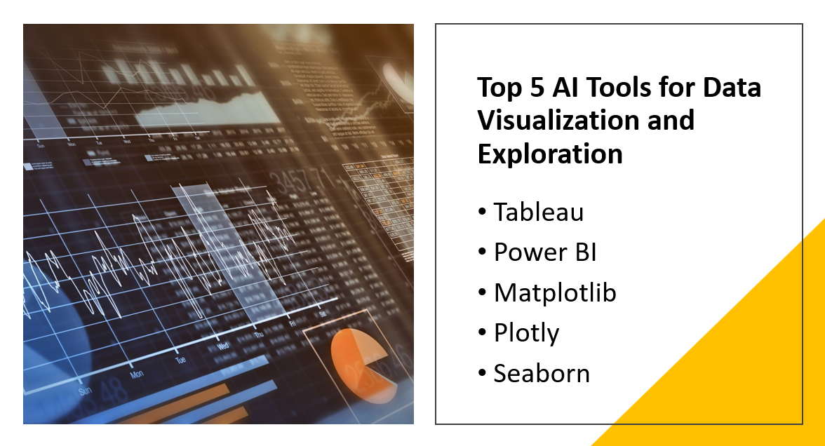
Here Are Our Top 5 AI Tools for Data Visualization and Exploration:
1: Tableau
Tableau is a widely recognized and powerful data visualization tool that has gained popularity across industries. It provides an intuitive and user-friendly interface, allowing users to transform complex data into interactive visualizations, reports, and dashboards. With its extensive capabilities, Tableau enables businesses and individuals to gain insights from their data and communicate those insights effectively.
Learn more
Overview and Importance
Tableau's importance lies in its ability to simplify the process of data analysis and presentation. It empowers users to explore, analyze, and visualize large datasets without requiring advanced programming or statistical knowledge. This accessibility makes it a valuable tool for professionals from diverse backgrounds, including data analysts, business intelligence experts, marketers, and decision-makers.
By employing interactive visuals and engaging dashboards, Tableau facilitates the identification of patterns, trends, and outliers in data. It enables users to create compelling visual narratives that convey complex information in a clear and concise manner. This makes it easier to communicate data-driven insights to stakeholders, drive informed decision-making, and uncover new opportunities for growth and improvement.
Tableau's versatility is another aspect of its importance. It supports various data sources, including spreadsheets, databases, cloud services, and big data platforms. It also offers connectivity with numerous data formats and can handle both structured and unstructured data. This flexibility allows users to work with diverse datasets and leverage the full potential of their data assets.
In summary, Tableau's significance lies in its ability to democratize data analysis and visualization. By providing a user-friendly interface, it enables users to unlock insights from complex data and effectively communicate those insights to a wider audience. Its intuitive features and wide-ranging capabilities make it a valuable tool for professionals across industries.
Key Features
Tableau offers a range of key features that empower users to create interactive and visually appealing data visualizations:
Interactive Dashboards
Tableau allows users to build interactive dashboards that provide a comprehensive view of data. Dashboards can include multiple visualizations, such as charts, graphs, and tables, which can be customized and arranged to facilitate data exploration and analysis. Users can interact with the dashboards, drill down into specific data points, apply filters, and gain deeper insights in real time.
Charts and Graphs
Tableau offers a wide array of chart types, including bar charts, line graphs, scatter plots, heat maps, and more. These visualizations can be easily created and customized to present data in a meaningful way. Users can adjust colors, labels, axes, and apply various formatting options to enhance the visual impact of their charts and graphs.
Maps
Tableau allows users to plot geographic data on maps, providing a spatial context to the analysis. Users can create maps with different layers, add custom geocoding, and integrate with geographic data sources. Interactive maps enable users to explore data across different regions and perform location-based analysis.
Data Blending
Tableau offers robust data blending capabilities, allowing users to combine data from multiple sources into a single analysis. It can connect to various data repositories, such as databases, spreadsheets, and cloud services. With data blending, users can integrate and analyze disparate data sets seamlessly, gaining a holistic view of their data.
Real-Time Collaboration
Tableau enables real-time collaboration among team members. Multiple users can work on the same visualization or dashboard simultaneously, making updates and changes visible to all collaborators in real time. This feature enhances teamwork, streamlines decision-making processes, and promotes a collaborative data-driven culture within organizations.
AI Integration and Advantages
Tableau offers integration with AI technologies, such as machine learning models, to enhance data analysis capabilities:
Advanced Analytics: Tableau allows users to integrate and utilize pre-built machine learning models or custom models developed using popular AI frameworks. By integrating AI models, users can leverage advanced analytics capabilities within Tableau. This integration enables users to perform predictive analysis, anomaly detection, clustering, and other advanced techniques to gain deeper insights from their data.
Natural Language Processing (NLP): Tableau supports NLP capabilities, allowing users to interact with their data using natural language queries. Users can ask questions about their data in plain English, and Tableau's AI-powered capabilities can interpret the queries and provide relevant visualizations or insights. NLP integration makes data exploration more accessible to a broader range of users and speeds up the process of data discovery.
Automated Insights: Tableau incorporates automated insights through its AI-driven features. It can automatically analyze data and generate intelligent recommendations and insights, highlighting important patterns, trends, and outliers in the data. This saves time and effort for users, enabling them to focus on interpreting the insights and making data-driven decisions.
Using Tableau for AI-driven data visualization and exploration offers several advantages:
Enhanced Data Understanding: AI integration allows users to uncover hidden patterns and relationships in data that may not be immediately apparent. By leveraging machine learning algorithms and predictive analytics, Tableau helps users gain a deeper understanding of their data and make more informed decisions.
Faster Insights: AI-powered features in Tableau automate certain aspects of data analysis, reducing the time required to derive insights. Automated recommendations, anomaly detection, and predictive capabilities help users quickly identify important trends, outliers, and potential opportunities.
Democratization of AI: Tableau's user-friendly interface and integration with AI technologies make advanced analytics and AI-driven insights accessible to a broader audience. Users without specialized AI or data science knowledge can leverage the power of AI for.
2: Power BI
Power BI is a business intelligence and data visualization tool developed by Microsoft. It enables users to connect to various data sources, transform raw data into interactive visualizations, and share insights across organizations. Power BI has gained significant importance in the business world due to its capabilities in simplifying complex data analysis and providing actionable insights.
Learn more
Overview and Importance
Power BI's importance lies in its ability to empower users to make data-driven decisions. It allows businesses to consolidate and analyze data from multiple sources, including databases, spreadsheets, cloud services, and online services. By providing a centralized and intuitive interface, Power BI enables users to explore data, create visually appealing reports and dashboards, and share them with colleagues and stakeholders.
Key Features
Data Connectivity
Power BI offers a wide range of data connectors, allowing users to connect to various data sources, both on-premises and in the cloud. It supports popular databases, such as SQL Server, Oracle, and MySQL, as well as cloud services like Azure, Salesforce, and Google Analytics. This extensive connectivity enables users to access and integrate diverse data sources for comprehensive analysis.
Power BI provides robust data transformation and modeling capabilities. Users can shape and clean data using Power Query, a powerful data transformation tool. Power BI also supports data modeling, allowing users to define relationships between different tables, create calculated columns and measures, and optimize data for analysis.
Interactive Visualizations
Power BI enables users to create interactive visualizations to represent data effectively. It offers a wide range of visual elements, including charts, graphs, maps, tables, and cards. Users can customize these visuals by adjusting colors, formatting, and adding interactive features such as drill-down and filtering. The interactive nature of Power BI visualizations facilitates data exploration and allows users to derive insights in real time.
Dashboards and Reports
Power BI allows users to create dynamic dashboards and reports that present key insights at a glance. Dashboards provide a consolidated view of relevant data and visualizations, allowing users to monitor performance, track KPIs, and identify trends. Reports offer more detailed analysis, combining visuals, tables, and narratives to provide comprehensive insights.
Collaboration and Sharing
Power BI enables easy collaboration and sharing of insights within organizations. Users can publish reports and dashboards to the Power BI service, allowing colleagues and stakeholders to access and interact with the shared content. Power BI also offers security features, allowing users to control access to data and ensure privacy.
AI Integration and Advantages
Power BI integrates with AI technologies to enhance data analysis and decision-making:
Natural Language Query: Power BI incorporates natural language processing (NLP) capabilities, allowing users to ask questions about their data using plain language. Users can type or speak questions related to their data, and Power BI's AI algorithms interpret the queries and provide relevant visualizations or answers. NLP integration makes data exploration more accessible and accelerates insights discovery.
AI Visuals and Insights: Power BI offers AI-powered visuals and insights, allowing users to leverage machine learning algorithms without advanced programming skills. Users can access pre-built AI visuals, such as key influencers or decomposition trees, that automatically analyze data and present meaningful patterns and correlations. AI insights help users identify significant factors impacting their business and make data-driven decisions.
Cognitive Services Integration: Power BI can integrate with Microsoft Cognitive Services, enabling users to incorporate AI capabilities such as sentiment analysis, image recognition, and text analytics into their data analysis. This integration allows users to derive additional insights from unstructured data sources, such as social media feeds or customer feedback, enhancing the depth of analysis.
Using Power BI for AI-driven data visualization and analysis provides several advantages:
Advanced Analytics: AI integration in Power BI enables users to apply advanced analytics techniques, such as predictive analytics and anomaly detection, to gain deeper insights from their data. Users can leverage machine learning models within Power BI to uncover trends, forecast future outcomes, and detect anomalies in real time.
Automation and Efficiency: AI-powered features in Power BI automate repetitive data analysis tasks, reducing manual effort and increasing efficiency. Users can leverage AI for data preparation, insights generation, and report generation, freeing up time to focus on more strategic analysis and decision-making.
Democratization of Analytics: Power BI's user-friendly interface and AI integration make advanced analytics accessible to a wider range of users. Non-technical users can leverage AI capabilities without extensive programming or data science expertise, democratizing the use of AI-driven insights across organizations.
In conclusion, Power BI's integration with AI technologies enhances its data analysis capabilities and empowers users to gain valuable insights from their data. Its extensive features for data connectivity, interactive visualizations, and collaboration make it a versatile tool for businesses to drive data-driven decision-making.
3: Matplotlib
Matplotlib is a popular data visualization library for the Python programming language. It provides a wide range of tools and functionalities for creating high-quality plots, charts, and graphs. Matplotlib is widely used in various domains, including data analysis, scientific research, and machine learning, due to its flexibility, customization options, and extensive support within the Python ecosystem.
Learn more
Overview and Importance
The importance of Matplotlib lies in its ability to effectively communicate data visually. It enables users to create visually appealing and informative visualizations that aid in understanding complex data patterns and relationships. Matplotlib allows users to showcase their data in a variety of formats, ranging from simple line plots and scatter plots to more advanced 3D plots, heatmaps, and histograms. Its versatility and extensive customization options make it a powerful tool for data exploration and presentation.
Key Features
Plotting Functions
Matplotlib provides a comprehensive set of plotting functions to create a wide range of visualizations. Users can generate line plots, scatter plots, bar plots, histograms, pie charts, box plots, and more. These functions offer various customization options for colors, markers, labels, and axes, allowing users to tailor their visualizations to specific requirements.
Subplots and Layouts
Matplotlib enables the creation of multiple plots within a single figure using subplots. Users can arrange plots in rows, columns, or grids to compare and analyze different datasets or aspects of the same dataset. This feature is useful for visualizing multiple dimensions of data or comparing different scenarios.
Customization and Styling
Matplotlib offers extensive customization options to control the appearance and style of visualizations. Users can modify line styles, marker types, font properties, axis limits, and other elements to create visually appealing and publication-quality plots. Matplotlib also supports the use of themes and stylesheets to easily apply consistent styling across multiple plots.
Annotations and Labels
Matplotlib allows users to add annotations, text, and labels to their plots, enhancing the clarity and understanding of the presented data. Annotations can be used to highlight specific data points or regions, add explanatory text, or provide additional context to the visualization.
Export and Integration
Matplotlib enables users to save plots in various file formats, including PNG, PDF, SVG, and more. This makes it easy to integrate Matplotlib visualizations into reports, presentations, websites, or scientific publications. Matplotlib also integrates seamlessly with other Python libraries such as NumPy and Pandas, facilitating data manipulation and analysis.
AI Integration and Advantages
Matplotlib itself does not provide direct integration with AI technologies. However, it is commonly used in conjunction with AI libraries and frameworks, such as TensorFlow or PyTorch, to visualize and analyze the results of machine learning models. Matplotlib can be utilized to plot training curves, visualize model outputs, and showcase evaluation metrics.
The advantages of using Matplotlib in AI-driven applications include:
Result Visualization: Matplotlib allows users to visualize the outputs and predictions of machine learning models. It enables the creation of plots that demonstrate the performance, accuracy, and behavior of AI algorithms. Visualizing model outputs helps in understanding and interpreting the results of complex AI models.
Exploratory Data Analysis: Matplotlib is a valuable tool for exploratory data analysis (EDA), a crucial step in any AI project. It helps in understanding the distribution, relationships, and patterns in the input data. Matplotlib's flexibility and wide range of plotting options enable users to explore and visualize various aspects of the data before feeding it into AI models.
Model Interpretability: AI models often require interpretability to gain insights into the decision-making process. Matplotlib can be used to plot feature importance, saliency maps, or other visualization techniques to explain the model's behavior and identify influential factors. These visualizations help in understanding the model's decision process and build trust in AI-driven systems.
In summary, Matplotlib is a powerful data visualization library for Python that offers a wide range of features and customization options. While it does not provide direct integration with AI technologies, it is commonly used to visualize and analyze the outputs of machine learning models, aid in exploratory data analysis, and enhance model interpretability in AI-driven applications.
4: Plotly
Plotly is a versatile data visualization library that provides interactive and dynamic visualizations for data analysis and presentation. It offers a range of tools and APIs for creating interactive plots, charts, and dashboards that can be embedded in web applications or shared online. Plotly's importance lies in its ability to create visually stunning and engaging visualizations that enhance data exploration and communication.
Learn more
Overview and Importance
Plotly supports multiple programming languages, including Python, R, and JavaScript, making it accessible to a wide range of users. Its interactive nature allows users to zoom, pan, hover over data points, and dynamically update visualizations, enabling a more immersive and exploratory experience. Plotly visualizations are widely used in domains such as data analytics, business intelligence, scientific research, and interactive data-driven storytelling.
Key Features
Interactive Visualizations: Plotly enables the creation of interactive visualizations with a rich set of features. Users can create line plots, scatter plots, bar charts, area charts, pie charts, heatmaps, and more. The interactive capabilities allow users to zoom, pan, and hover over data points to explore specific details. Plotly also provides options for adding annotations, tooltips, and custom interactions to enhance the interactivity of the visualizations.
Dashboards and Layouts
Plotly allows users to build interactive dashboards and reports by combining multiple visualizations into a unified layout. Users can arrange plots and charts in a grid or customize the layout to create a visually appealing and coherent dashboard. Interactive controls and filters can be added to enable dynamic updates across the dashboard, providing a comprehensive view of the data.
Web-based Deployment
Plotly offers web-based deployment options, allowing users to share their visualizations and dashboards easily. Plotly provides cloud-based hosting and sharing platforms where users can publish their visualizations and share them with others. Embedding Plotly visualizations in websites, blogs, or web applications is also straightforward, providing seamless integration into online platforms.
Collaborative Development
Plotly supports collaborative development, enabling multiple users to work on a visualization project simultaneously. Users can share their projects, collaborate on creating visualizations, and see real-time updates. This feature facilitates teamwork, knowledge sharing, and streamlines the development process.
Customization and Styling
Plotly offers extensive customization options to tailor the appearance and style of visualizations. Users can customize colors, fonts, annotations, and layout parameters to create visually appealing and branded visualizations. Custom themes and templates are available to maintain consistency across multiple visualizations.
AI Integration and Advantages
Plotly integrates with AI technologies to enhance data analysis and visualization:
AI-powered Insights: Plotly can be used to visualize the outputs and insights generated by AI models. Users can plot predictions, classification results, or anomaly detection outputs to understand and interpret the results of AI algorithms. Interactive Plotly visualizations enable users to explore and interact with AI-generated insights, facilitating a deeper understanding of the model's performance.
Data Exploration and Feature Analysis: Plotly is useful for visualizing and exploring datasets before feeding them into AI models. It allows users to visualize data distributions, relationships, and patterns, assisting in the feature selection process. Interactive Plotly visualizations enable users to drill down into specific data subsets, identify outliers, and gain insights that can inform the AI modeling process.
Model Evaluation and Comparison: Plotly can be employed to visualize evaluation metrics, performance comparisons, and model outputs during the AI model development process. Users can create interactive plots to compare different models' performance, visualize learning curves, or analyze model errors. This aids in model selection, fine-tuning, and decision-making.
Interactive Data Storytelling: Plotly's interactive capabilities make it an excellent tool for creating data-driven stories. Users can create interactive visualizations, combine them with explanatory text, and build narratives that guide users through the data story. Interactive Plotly visualizations allow readers to explore the data at their own pace, fostering engagement and comprehension.
In summary, Plotly is a powerful data visualization library known for its interactive and dynamic visualizations. It offers features for creating interactive plots, dashboards, and reports, facilitating data exploration and communication. With its integration with AI technologies, Plotly enhances data analysis, enables AI model visualization, and supports interactive data storytelling.
5: Seaborn
Seaborn is a Python data visualization library built on top of Matplotlib. It is specifically designed for creating visually appealing statistical graphics. Seaborn simplifies the process of creating complex visualizations by providing high-level functions and a set of aesthetic themes. It is widely used in data analysis, statistical modeling, and exploratory data visualization tasks.
Learn more
Overview and Importance
The importance of Seaborn lies in its ability to create attractive and informative statistical visualizations with minimal code. It offers a wide range of predefined color palettes, plot styles, and statistical plotting functions that facilitate the visualization of complex relationships in data. Seaborn's focus on statistical graphics and its seamless integration with other Python libraries make it a valuable tool for both data scientists and researchers.
Key Features
Statistical Plotting
Seaborn provides a set of high-level functions for creating statistical visualizations. It offers functions for plotting univariate and bivariate distributions, regression models, categorical data, time series, and more. These functions simplify the process of visualizing statistical relationships and patterns in the data.
Aesthetic Enhancements
Seaborn allows users to easily enhance the aesthetics of their plots. It provides a variety of color palettes and plot styles that can be applied to create visually appealing visualizations. Users can customize the color schemes, plot backgrounds, and fonts to match their preferences or the requirements of their analysis.
Integration with Pandas
Seaborn seamlessly integrates with the Pandas library, a popular data manipulation and analysis tool in Python. It can directly accept Pandas DataFrames as input, making it easy to visualize and explore data stored in Pandas data structures. This integration streamlines the data visualization workflow and enables efficient data analysis.
Flexible Categorical Plotting
Seaborn offers versatile categorical plotting functions for visualizing data with categorical variables. It provides functions for creating bar plots, count plots, point plots, box plots, and violin plots. These functions allow users to compare and analyze data across different categories, making it suitable for tasks such as group comparisons and trend analysis.
Statistical Annotations
Seaborn supports the inclusion of statistical annotations in plots. Users can add text annotations, confidence intervals, or statistical tests results to highlight significant findings or provide additional context to the visualizations. This feature enables users to effectively communicate statistical information within their plots.
AI Integration and Advantages
Seaborn itself does not have direct integration with AI technologies. However, it can be used in conjunction with AI libraries and frameworks for visualizing the results of AI algorithms. The advantages of using Seaborn in AI-driven applications include:
Model Evaluation: Seaborn can be employed to visualize and analyze the performance metrics of AI models. Users can plot metrics such as accuracy, precision, recall, or ROC curves to assess model performance. Visualizing model evaluation results using Seaborn enables users to compare different models, tune hyperparameters, and make informed decisions during the model development process.
Feature Analysis: Seaborn can be used to explore the relationships between features and their impact on AI model predictions. Users can create visualizations, such as scatter plots or box plots, to investigate the relationship between input features and target variables. This helps in understanding feature importance, identifying outliers, and gaining insights into the data for AI modeling purposes.
Data Visualization for AI Interpretability: AI models often require interpretability to understand the reasoning behind their predictions. Seaborn can be utilized to create visualizations that explain the decision-making process of AI models. For example, visualizing feature importances or partial dependence plots can provide insights into how the model makes predictions and enhance interpretability.
In summary, Seaborn is a powerful data visualization library that focuses on creating attractive and informative statistical graphics. It simplifies the process of visualizing complex relationships in data and integrates seamlessly with the Pandas library. While it does not provide direct integration with AI technologies, Seaborn can be used to visualize AI model evaluation results, analyze features, and enhance interpretability in AI-driven applications.
Conclusion
Data visualization and exploration play a crucial role in AI applications. They help in understanding patterns, relationships, and insights hidden within data, facilitating informed decision-making and driving innovation. Effective data visualization enables the communication of complex information in a visual format, making it easier to grasp and interpret.
In this article, we explored 5 top AI tools for data visualization and exploration. Each tool offers unique features and benefits:
Tableau: A powerful data visualization tool with an intuitive interface and interactive dashboards for exploring and presenting data across industries.
Power BI: A comprehensive business intelligence tool that provides interactive visualizations, real-time collaboration, and AI integration for advanced data analysis.
Matplotlib: A versatile library for creating static, publication-quality visualizations in Python, widely used in scientific research, data analysis, and machine learning.
Plotly: A dynamic and interactive data visualization library that allows users to create visually stunning visualizations and dashboards with web-based deployment options.
Seaborn: A specialized library for statistical graphics in Python, offering high-level functions and aesthetic enhancements for visualizing relationships in data.
It's important for readers to explore these tools and choose the ones that best suit their needs and project requirements. Experimenting with different tools allows users to leverage the unique features of each and discover the most effective approaches for their specific tasks.
However, mastering data visualization and exploration techniques in the AI field requires ongoing learning and practice. It's essential to stay updated with the latest tools, techniques, and best practices. Continuously improving data visualization skills and understanding how to extract meaningful insights from data are key for success in AI applications.
By embracing the power of data visualization and exploration and leveraging the capabilities of these AI tools, users can unlock the full potential of their data, gain deeper insights, and make data-driven decisions that drive progress and innovation in their respective fields.